
We recently shared the work we did to rebuild our tech stack to support the redesigned Facebook.com. When that project began, we saw an opportunity to integrate greater accessibility into the site and build it into the foundation in a way we couldn’t have done without this rebuild. The previous site had been built upon in layers since its launch in 2004, resulting in a large and complex site. This complexity made it difficult to incorporate sweeping changes without causing regressions. The new site enabled us to prevent accessibility issues from the beginning, and a new codebase made it possible for us to integrate new accessibility tools and features that would have been difficult or impossible to build and maintain on the old site.
By taking advantage of the latest advancements in React, we have been able to introduce new accessibility tools, techniques, and technology. The result is a carefully crafted experience for people who benefit from increased legibility, Accessible Rich Internet Applications (ARIA) markup, and keyboard navigation. In our last round of research with screen reader users, all participants wanted to remain opted into the site, citing its improved accessibility. Today, we are sharing some of the techniques we introduced that advance accessibility support on Facebook.com.
How we did it
To make the new site more accessible, we were able to introduce guardrails right from the beginning, integrate focus management into the core infrastructure, support features that weren’t available when we built the original site in 2004, and build in monitoring and analysis to help prevent regressions as we continue to add new features.
Linting and flow
Linting and Flow typing enable us to validate accessible markup and assert that accessibility properties (like labels) always be provided. Though we had used these techniques on the old site, introducing them early on allows us to be more strict about the rules we can validate and help prevent any new violations from shipping. We are using the open source eslint-plugin-jsx-a11y plugin to help us catch ARIA violations as developers build new features. With Flow typing, we enforce the general principle that required ARIA properties always be provided. For example, every button and link requires that a label property be provided with a translated string:
type ButtonProps = $ReadOnly<{
	...
	label: TranslatedString,
	...
}>;
By requiring a translated label, we will throw an error and prevent them from pushing their changes if a string is provided without considering internationalization. This enables our accessibility labels to scale globally as well.
Scalable font sizes
For people with impaired vision, the text on a page should respect user-specified defaults or be dynamically resizable to be legible. By using rems (relative units), we’re able to achieve this, but that introduces a few challenges: rems are difficult to enforce, introduce engineering overhead, and require designs created with CSS pixel values. To solve this and support font scaling, we’ve set up a transform so that we code in pixels and our build tool converts them to rems when the code is compiled. This allows us to easily change the base font-size unit so that all text scales appropriately, even if a developer styles a component using pixels.
Contextual headings
For people using a screen reader, headings are one of the most common ways to navigate a page. They allow people to understand the structure of the page and jump between sections. However, for this to work, the heading levels need to be specified with a logical ordering. This becomes difficult to maintain with a layout like ours, which changes frequently as we develop and add new features.
Using React Context, we’ve introduced an API to ensure that the heading hierarchy is always implemented correctly, in descending order. When a heading is nested within another section, we automatically increase the heading level so that the heading structure matches the visual layout. This makes the heading structure flow more naturally and provides a clearer layout for those using a screen reader.
<Heading>
  Main heading
</Heading>
<section>
   <Heading>
     Nested heading
   </Heading>
   Nested content
</section>
Would render as:
<h1>Main heading</h1>
<section>
	<h2>Nested heading</h2>
	Nested content
</section>
Contextual keyboard commands
In the past, resolving key command conflicts, debugging keyboard shortcuts, and supporting nested commands was a huge undertaking. Because there are so many ways to set up a key command (by adding a global listener, adding a key handler to the element or its container, etc.), it’s difficult to track down where a key command is registered and whether the specific command combination is already in use. To simplify the keyboard registration process, we again took advantage of React Context to create a centralized API for registering key commands tied to a context. Developers can register contextual commands based on focus, commands associated with a specific view, and globally accessible commands. With a central system for maintaining key commands, we are also able to easily debug and view all available commands at a given time. Just press “shift + ?” to see the list of active commands. The list will update dynamically as users move focus or navigate around Facebook.
Runtime analysis and prevention
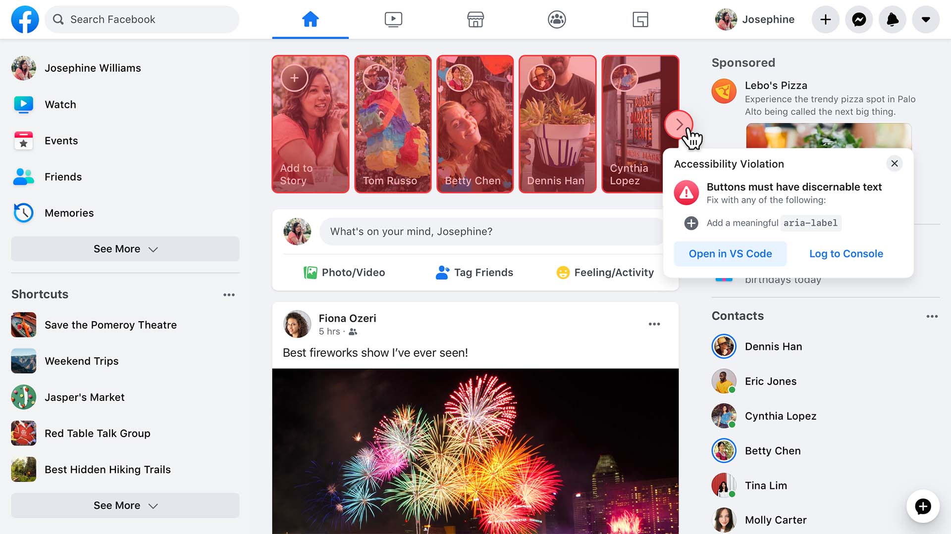
As static analysis tools, linting and Flow only get us so far. To fill in the gaps of markup assertion, we introduced a runtime analysis tool that enables us to validate markup as it is presented to the people on the site. Unlike other similar open source plugins, which require a developer to opt in, our solution runs automatically in the background and presents itself as a visual barrier to the experience, using a red overlay to express the severity of the issue for a non-sighted person.
Accessible components
Reusable components are one of the most powerful tools for enabling engineers to build accessible experiences quickly with high quality. Our reusable React components inherit functionality from a core set of base components that have built-in accessibility. These components consist of interactive widgets such as buttons, links, and input components, as well as semantic markers such as headings and loading states. We can ensure that users on both browsers and assistive technology get a consistent experience with base components. We use the ARIA Practices Guide as a reference when building base components. This guide, created by experts in the field of web accessibility, defines a set of base widgets with detailed specifications about markup and behavior on various input devices. For example, it defines simple interactive widgets like buttons and links, as well as more complex interaction patterns like comboboxes, alert dialogs, tooltips, and carousels. React gives us the flexibility to model all of these widgets in components that can guarantee correct keyboard behavior and accessible markup, but provide no styling of its own. These components can be reused across different design systems and products. Here’s an example of how a developer might use a button component that’s built on top of an accessible base button widget:
<BlueButton
   label="Click me"
   onClick={doSomething}
/>
The developer only needs to provide a label and an event handler, and we will render the button with the appropriate ARIA markup and keyboard support.
Maintaining focus
Focus management has always been one of the most complex categories of accessibility support. For those using screen readers and sighted keyboards, it is important to manage focus placement. To provide a consistent experience for the people using the site and a reliable experience for our engineers, we created a set of React components that integrate well with our UI components and act as accessibility building blocks. These components can replace manual calls to .focus(), provide arrow key navigation, and enable control of the mouse vs. keyboard experience. They also enable engineers to declaratively define how keyboard focus should work across lists and grids, handle the inconsistencies that exist between browsers, and ensure that focus is properly recovered or restored when a behavior occurs that might cause focus to be lost. When moving focus through a list of items, engineers can leverage the FocusList component as shown:
import FacebookMenu from 'FacebookMenu';
import FacebookLink from 'FacebookLink';
import {createFocusList} from 'FocusList';

const [FocusList, FocusItem] = createFocusList();

function DropdownList({navItems}) {
 return (
   <FocusList wrap={true}>
     <FacebookMenu>
       {navItems.map(navItem =>
         <FocusItem>
           <FacebookLink href={navItem.href}>
             {navItem.label}
           </FacebookLink>
         </FocusItem>
       )}
     </FacebookMenu>
   </FocusList>
 );
}
Now when someone focuses on the DropdownList, they can use the up/down/pageUp/pageDown keys to navigate through the links in the list. When they get to the end, the focus is moved back to the start because we passed the wrap prop to FocusList. The engineer doesn’t need to worry about managing tabIndex, as this is all dealt with by FocusList.
Screen reader announcements
We often want to add a screen reader announcement as feedback to someone that their action was successful. Unless we have a visible confirmation message to focus on or wrap in special markup, the person using a screen reader has no way to tell when the UI has updated. For instance, when someone submits a comment or sends a message, we want to notify them without moving focus away from the input. An announcement can inform a person using a screen reader that their action was successful. We introduced a simple hook to make it significantly easier to create and maintain these announcements:
const sendAccessibilityAlert = useAccessibilityAlert();
sendAccessibilityAlert('Your comment has been submitted');
Behind the scenes, the hook appends an aria-live region to the page with the alert text. New announcements will replace the old announcement. The system also allows us to de-dupe repetitive alerts that happen in quick succession.
Though we recognize there is still more work to be done, we are committed to providing users with disabilities a great experience. We have built a solid technical foundation to make it possible to raise the ceiling of accessibility support. We hope you are as excited as we are about the progress we’ve made.
Looking ahead, we are focusing on new features to continue to elevate our support. We are exploring improvements to the keyboard experience as well as our automated alt text system. Beyond these engineering initiatives, we also continually review our product flows with people in the disability community and with accessibility specialists to help us find and address remaining issues and improve new features. Our goal is to create a valuable and equitable experience for all of the people using our site.


