Creative expression has evolved over time as media has progressed from print to radio, to television, to the internet. As a continuation of this trend, mobile devices today enable more opportunities for creative expression and interaction, powered by novel input gestures, high-resolution displays, convenient form factors, and ambient sensors. However, mobile devices still have several limitations and complexities — such as battery life, heterogeneity of device hardware, and network scarcity — that content creators must contend with. In addition, languages and tools for mobile content creation are still in their infancy, and many advertisers face challenges in telling stories to mobile audiences through engaging and interactive formats.
Our teams built Canvas as a step toward solving these problems. Canvas does not replace our other options; rather, it is a new addition to our storytelling portfolio. To build Canvas, our teams worked through a large number of technical challenges, foremost of which was the UI challenge of condensing the myriad creative requests from designers into a small set of components that are intuitive to use, yet flexible enough for brands to express their creativity. The result was a customizable combination of select, high-level primitives — autoplay videos, photos, tilt-to-pan media, carousels, buttons, headers, and rich text — that allow creators to bring stories to life in a full-screen immersive experience on mobile devices.

Evolution of Canvas
Canvas stemmed from the work done by several teams at Facebook and with the feedback from our marketing partners over the past few years. From a technical perspective, the Videos team helped build the infrastructure that allows us to handle efficient autoplay of videos, while the Paper and Instant Articles teams laid the groundwork for the rendering and layout engines we use in Canvas. The now open-sourced _AsyncDisplayKit_, for example, enabled us to do much of the UI sizing, layout, and rendering in the background to keep the native experience smooth and performant.
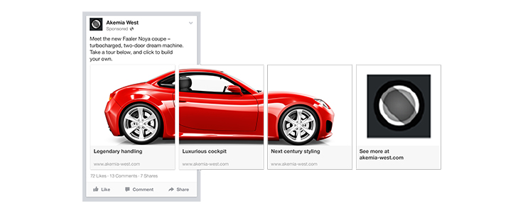
From a product evolution perspective, Canvas aligns with other mobile-first initiatives developed at Facebook, including the carousel format, which allows creators to utilize horizontal scroll in News Feed stories, and Lead Ads, which introduced features such as auto-filling forms to create native, fast experiences that are unimaginable on mobile websites. One key observation across the products was how creative designers hacked the constrained primitives we provided to compose completely new interactions. A very simple but visual example was a carousel ad made with a sequence of images that together revealed a high-resolution panorama shot of a luxury car. To see the whole picture, people had to scroll through all the cards in the carousel. The creative flexibility of Canvas, derived from a few high-level UI components, is based on the observations of how the creative community used our existing products.

Canvas packs in speed of loading and rendering, simple yet powerful native interaction primitives like tilt and horizontal scroll, and scalable video streaming and autoplay. We think of Canvas as a platform that will help us continue to experiment with mobile experiences and push the boundaries of mobile content creation and consumption.
A language to describe an expressive layout
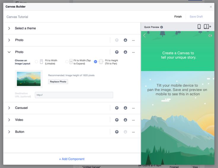
To restrict ourselves to a limited set of components, we had to design an API and a language that are powerful and expressive enough to handle complex use cases, while being almost human-readable and easy to build a UI around. On a high level, the language has two parts: (1) configuring components through attributes and (2) defining a composition of the components with a two-dimensional layout. Canvas Builder (the tool to build Canvases) is a testament to the power and simplicity of this concept, since it is built on top of the same API. While it’s very easy to use, Canvas Builder has led to a number of exciting and creative user experiences, some of which have surpassed even our own imagination.
Consider the implementation of the Carnival Cruise Canvas. One of the most interesting creative elements in this Canvas was creating the feeling of moving the cruise liner forward as a user scrolls. Following is a representation of how GraphQL is used to define its layout and components.
{
   "document": {
     "document_body_elements": {
       "nodes": [{
           "document_element_type": "VIDEO",
           "element_video": {
             "playable_url": "https://foo.bar/?videoid=1"
           }
         }, {
           "document_element_type": "VIDEO",
           "element_video": {
             "playable_url": "https://foo.bar/?videoid=2"
           }
         }, {
           "document_element_type": "VIDEO",
           "element_video": {
             "playable_url": "https://foo.bar/?videoid=3"
           }
         }, {
           "document_element_type": "PHOTO",
           "image": {
             "url": "https://foo.bar/?photoid=1"
           },
           "style_list": [
             "FIT_TO_HEIGHT" // Photo fits to height of screen and is tiltable. Also, this not a real comment
           ],
         }, {
           "document_element_type": "SLIDESHOW”,
           "child_elements": [{
             "document_element_type": "PHOTO"
           }, {
             "document_element_type": "PHOTO"
           }
           ...
           ],
           "style_list": [
             "FIT_TO_HEIGHT"
           ]
         },
         ...
       ]
     }
   }
 }
Components are laid out from top to bottom, as defined by the nodes of document_body_elements. In this case, the “animated” ship sailing through the ocean is actually three videos stitched together. While the API snippet is quite simple, the emergent experience that results from stitching autoplay videos is immediately delightful — people feel like their scroll action is moving the ship forward. It is this ability to express creativity through simple layouts that makes Canvas so powerful.
We designed the language to configure components by describing properties and attributes, rather than to build higher-level components from low-level primitives. In addition to defining specific properties of components, like image URLs, an interesting way to define component behavior is to associate a list of styles with a component. Each style encapsulates semantic information of rendering or behavior of a component. This is loosely analogous to CSS classes. For example, media components are laid out to fit to the width of the screen by default, with their height being automatically adjusted according to their aspect ratios. But if they have a FIT_TO_HEIGHT style set, they are laid out to fit to the height of the screen instead. If the width of the media is greater than screen width, it automatically becomes tiltable. This is evident in the fourth component from the Carnival Cruise Canvas above (tiltable image of the beach from the video).
Although designing the language for simplicity was important, we also realized the need to enable more customized or complex UI navigations and interactions. We enabled this by introducing the concept of “actions.” An action is applied to a component and is performed by the Canvas on click. There are multiple possible actions built into the language, including Open URL, Post Data, Activate Component, and Reload Canvas with ID. For instance, clicking a CTA button in Canvas triggers the Open URL action with the advertiser-specified URL. A majority of other interactions in a Canvas, including expanding an element, the ability to have a toggle button, “choose your own adventure” storytelling, and more can be handled with a limited set of actions. The theme of less allowing more applies to Actions as well.
To allow for a greater level of customizability, we then built the ability to perform chained actions, where actions with user interactions can have subsequent actions associated with them.

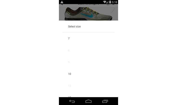
For example, consider an e-commerce setting for purchasing shoes. Clicking the “Add to Cart” button triggers the “Activate Component,” or, more specifically in this case, the “Open Selector” action, which lets you select a shoe size. Selecting a shoe size triggers a chained “Post Data” action that lets the backend know to add the particular item with the selected shoe size to your cart. Everything about this experience is fully controlled by the data model, without the need to add any new code.
Real-time creative preview
People working on bringing their ideas to life in Canvas Builder need a way to easily preview their work. We built a simulated preview on Desktop within Canvas Builder for immediate feedback, but right from the start we decided to focus on allowing true mobile previews at every stage of Canvas creation.
To achieve this goal, we designed Canvas on mobile to be opened via a deep link URL of the following form, where “1234” is a unique ID:
https://fb.com/canvas_doc/1234
This is exposed to creators in Canvas Builder once they finish a particular Canvas.
Every time creators hit “Preview on Mobile” from Canvas Builder, we generate a notification containing a Canvas deep link URL and send it to their mobile device. Clicking on the notification directly opens Canvas with the latest changes. We also add a cache buster to the URL so that the mobile clients can invalidate their GraphQL caches to ensure data freshness.
The result of this interactive preview is that people are now iterating on their ideas within Canvas Builder itself, and they can get a full and immediate preview of how the Canvas will appear on mobile.
Technical challenges
Mobile first
The layout of a Canvas is a tailored composition of high-level components in a linear fashion. We explicitly chose these high-level components to be designed for native mobile, as opposed to something like HTML/JavaScript, which lets you build anything and everything but requires a certain level of expertise. This choice lets us optimize each component for mobile performance. It allows the layout engine and native code to make assumptions about rendering and behavior, thereby leading to more performant mobile code. Furthermore, these high-level components can be independently implemented on iOS and Android, adhering to a unified component spec but with very different and optimized underlying implementations.
Optimizing for mobile made the challenge of creating a simple UI even harder. Differing aspect ratios and screen sizes between platforms and devices adds another layer of complexity that we wanted to abstract away from designers. For example, we solved this particular challenge by adding a simple constraint — Canvas only allows media components to either fit the width of the screen or fit the height of the screen and become tiltable. This frees the designers from thinking about the complexities of cropping and stretching. Apart from making a designer’s life easier, this has the added benefit of a more streamlined view hierarchy on mobile and therefore better scroll performance.
Loading speed and time to interact
Mobile content needs to be fast and performant, and it needs to feel native. Context switching, such as going from News Feed to a slow third-party website, can lead to poor experiences for people. This is magnified for people with network or bandwidth limitations, especially in emerging markets with predominantly 2G network conditions. The ability to deliver engaging content in such conditions has been and will remain a constant focus for us.
Solving the problem of “perceived speed” across the board included network and data transmission optimizations such as:
- Creating small, roughly 200-byte preview images for all media in Canvas, and sending the raw image data in the initial GraphQL result. A blurred preview of the Canvas is ready almost instantaneously, and while it may take longer to fully download the media content, this has the effect of improving visibility of some of the Canvas content during load time.
- Optimizing delivery from the server side by sending down content that is sized precisely to fit a specific device’s dimensions and layout. An image that is uploaded as 3,000 x 3,000 pixels but delivered to a device of size 960 x 640 and laid out to fit the width of a screen will result in a scaled-down 640 x 640 image being sent down to the device.
Lower down on the technology stack, we also worked on a lot of client-side optimizations to ensure the perception of “instant” load and rendering. Some of the solutions we engineered include the following:
- Prefetching the GraphQL query that defines the layout from News Feed. This GraphQL result also includes previews of the images within Canvas, now ready to be used as a placeholder while the media is fetched.
- On iOS, precalculating and measuring the layout before Canvas transitions onto the screen. This is done async in the non-UI thread, and the challenge of rendering the Canvas transition on screen is now merely one of drawing the precalculated layout per frame. AsyncDisplayKit does a lot of the heavy lifting here.
Video loading and autoplay
We leveraged a lot of work from the Videos team and Instant Articles team at Facebook to allow videos with different sizes and variable layouts in Canvas to autoplay on enter. Efficiently autoplaying videos without any perceived buffer or jitter is a huge technical challenge on its own. Creating an awesome autoplay experience involved improving on video encoding and CDN delivery; building a completely customized player where we can tune low-level parameters instead of using standard SDK video or media players; predicting prefetch and optimal level of buffering based on scroll behavior; and predicting which video will get activated in view port next. In addition, we added modifications to the video player to support enhanced interactions like tilt-to-pan videos in Canvas, and to handle the state correctly when multiple videos are simultaneously in the view port.
Designing with engineering principles
Designing products with performance, simplicity, and extensibility in mind are some engineering best practices. Applying these technical principles as we developed Canvas enabled us to build a better experience for creators.
Performance is important on mobile: We know through multiple UX studies that context switching and slow load times for the mobile web result in bounce rates and frustrated people. Measurable and noticeable improvements in performance lead to better product performance. For Canvas, cutting down perceived load time by using preview images resulted in a smoother experience.
Minimizing complexity: In the end, complexity can negatively impact product adoption, so we worked to ensure that Canvas was easy to get started with and use, distilling down product requests into core functionality to build. We are continuing to focus on simplicity, including creating easier onboarding, help tools, and getting-started flows for Canvas Builder.
Designing for extensibility from day one: Along with performance, the other core engineering principle that defined the architecture of Canvas was flexibility. This allowed us to architect solutions with future extensibility in mind. The deep link URL scheme we adhered to early on is a prime example of an engineering solution that was unnecessary on day one but supported new features as the product evolved.
It allowed us to:
- Help advertisers run Canvas ads by simply dropping the Canvas URL into a regular link ad in page post composer or ads’ APIs and interfaces
- Build notification-based previews later on
- Build fallbacks for Canvas being opened on desktop or mobile web
- Extend Canvas in the future to register the http URL on iOS/Android and allow a Canvas to be opened from a message, email, etc.
Instrumentation: The ability to measure product use and log system performance of various components enabled us to make the right decisions and move fast.
Looking ahead
There are a lot of ideas in the pipeline for Canvas. We are super-stoked about taking creativity on mobile to the next level with Canvas and sharing our work with the developer community. Looking ahead, we are excited about extending our current high-level components such as videos by building scrubbable videos and 360 videos, and about building new components, like auto-filled forms. We are also looking forward to making the Canvas Creation API available to developers for building tools, interfaces, and an ecosystem that could power the next generation of engaging experiences on mobile.


