
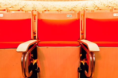
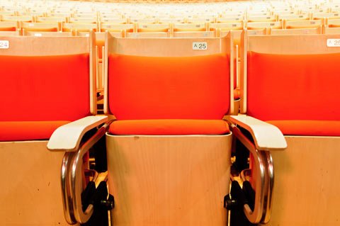
Two of my passions in life are travel and photography. After working hard to build Facebook Timeline, I spent a few weeks traveling around Australia with my wife and camera. Inside the Sydney Opera house I took a photo that I just couldn’t wait to share with my friends. But when I uploaded it to Facebook the seat ended up looking way too red. It was a subtle change, but it bothered me enough to investigate.
At Facebook, after you’ve been working on one project for a year, you’re encouraged to spend a month on another team. This “Hackamonth” is designed to keep you from ever getting stuck in a rut and help broaden your understanding of what the rest of the company is doing. When I got back from my trip, I decided to start my Hackamonth on the Photos team to spend some time with the people dedicated to making the Photos experience better for everyone viewing photos on Facebook (and the people taking them). Figuring out this color issue was my first order of business.
At first glance, it seemed we must be doing something wrong with color profiles. Color profiles are the part of a file that describe how to turn the red, green and blue numbers in the file into the colors you see on your screen. Every monitor has a different color bulb in the back and the screen passes different colors and amounts of light through. Color profiles are what ensures a photo looks the same on every monitor despite these differences.
The internet standard color profile is called “sRGB.” Every photo on Facebook and most of the internet uses the sRGB profile. For some reason most web browsers don’t assume the image is sRGB, and you actually have to redefine sRGB in every single image. Our photos software was already quite capable of defining sRGB in every image, but that definition was pretty big, and turning it on would have slowed down page loading.
The standard sRGB definition was 3KB. That’s not a big deal for large images, but our thumbnails in newsfeed and timeline are pretty small. Adding the standard definition can slow down loading by up to 30%. Now my quest had become making the sRGB definition smaller.
Apostolos “Toli” Lerios is our resident image scientist. He’s also really good at reading giant specification documents and determined which parts of the color profile weren’t actually necessary to display the image. Here’s the standard profile and the standard profile with all the extra bits removed:
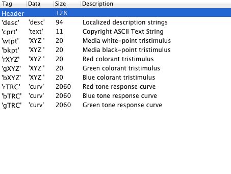
You might be wondering how those three lines of 2060 bytes add up to 3KB. Fortunately, the profile can share those 2060 bytes across red, green, and blue. The software we were using to create profiles didn’t do this by default, so Toli wrote a small C program to remove the redundant bytes.
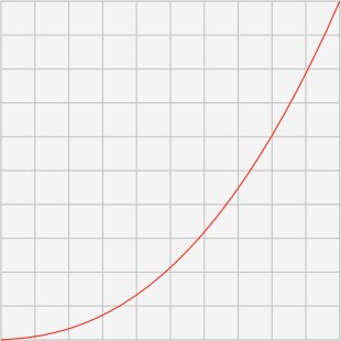
Still, a big chunk of the space was taking up by the 2060 byte “tone response curve.” These curves define the graph showing one part of the relationship between the numbers in the file and what you see on screen. Here’s the curve for sRGB:

For the detail-minded, it’s close to a gamma curve, but not quite. There’s actually a tiny section at the front that’s a line, followed by a gamma curve. In the standard sRGB profile, this combined line/curve is represented by sampling 1024 points along the curve.
A JPEG image only has 256 possible values for each color, so straight away we can see that 1024 points is more than we need. The question becomes, how few points can we get away with?
Twenty-six. It’s sort of a magic number. Toli realized that the transition from line to curve occurs at almost exactly 1/25th of the way across. By using 26 points our second point lands almost exactly at that transition.
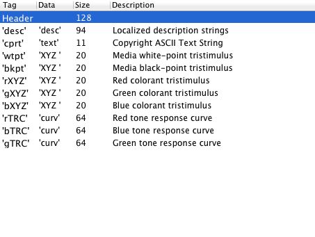
So our first point is black, our second is perfectly on that line segment, and the 26th point is pure white. I wrote a small program that numerically optimized the remaining 23 points. Paradoxically you get better results if the 23 points don’t land directly on the curve. Here’s the result:
Can you see the difference? I can’t. We checked our results with the official standard for measuring color accuracy (DeltaE CIE94) and it showed our maximum error was about half of what is noticeable by human vision.
Before the new profile, we couldn’t attach the profile to thumbnails at all because it was too big. Now that we have the tiny profile (I like to call it TINYsRGB) we can attach it to every photo, even thumbnails. Here’s the final profile description, it takes up 524 bytes. It’s now attached to every photo you see on Facebook.
As someone who loves photography and plans to upload many more pictures to Facebook, I want to make sure the photos experience is as good as it can be. I remember Zuck once saying something along the lines of “Even if what you’re working on is the most important thing for the company, if it’s not the most important thing to you then you’re not being as effective as you should be.” I’m honored to be working somewhere that holds true to that belief.
And after everything was said and done, my photo finally looks like it did in the opera house:
Ryan Mack extended his Hackamonth indefinitely and is now a full member of the Photos team, where he is going to keep finding ways to improve both our performance and quality. When he’s not busy taking photos.


