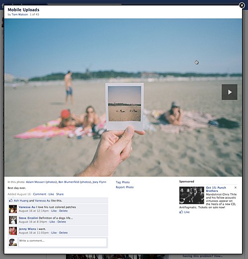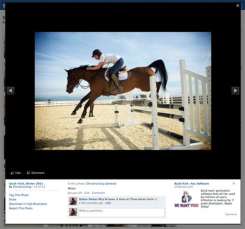
When we looked to revamp the Photos experience, we faced many challenges. While Photos is one of the most core experiences on Facebook, with over 100 million photos uploaded per day, it’s supported by some of the oldest code in the system and was in dire need of an upgrade.
By redesigning the Photo Viewer, users now view over 5% more photos, equating to an increase in roughly a billion photo views every day.
How We Did It
We started by outlining the problems with our current experience:
- The most obvious was reliability. Images were slow to load, and sometimes hung indefinitely. Users were forced to refresh their browsers to view photos and comments.
- Viewing photos from News Feed meant having to open multiple tabs or be forced to lose your place. Not a big deal for the computer-savvy, but not a common practice for a large percentage of our users.
- Reading comments on photos was cumbersome. A standard practice was to view a photo, scroll down to read the caption and comments, scroll back up to page, and then repeat.
- The JavaScript to load and cache photos and comment data was heavy; it was pieced together over the years as browser technology evolved and requirements changed.
An upgrade should improve upon all these areas and ideally create a more positive experience that would increase engagement around photo views, tags, comments, and likes.
We began by experimenting with a few design concepts. Early on, we discovered that using a pop-up solved a lot of our needs. The pop-up would enable users to keep their place in News Feed, and it could be very lightweight.
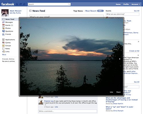
Although we liked the simplicity of the dialog, it didn’t leave any room for data about the photo, or a way to comment or tag. We expanded the designs into a larger lightbox overlay that would enable more interaction as well as let users view larger photos if their screen resolutions allowed.
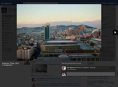
We then made some big decisions based on our experience testing out these initial prototypes. First, photos felt much more vibrant on black and really stood out more against the background. Second, without the ads in the right column, the image was free to take up extra space, allowing for a photo to span the full width of the page. Lastly, we decided that although the images looked good on black, the caption and comments were difficult to read, so we moved to a two-tone layout with the ability of fitting larger-sized images.

At this point we felt confident in the design and began looking at the engineering side of the project. We faced some big challenges trying to reach our goal to increase photo size capability. For example, some photos were too big when viewed on a smaller display to fit within the screen. We wanted to avoid burdening the user with scrolling to see the whole photo. Thus, we needed to devise a solution to scale down the images. Additionally, one of our original problems was the inability to see comments on larger photos. So we needed to provide space below the photo that will always be visible.
In summary, we gave ourselves these requirements on the design:
- There must be a minimum of 100 pixels below the image that is always visible for the caption and comments. This means shrinking the image to make room if the user’s display is too low resolution.
- The lightbox must sit over the page and scroll if necessary, but the page underneath it must not change.
- We need to be able to easily add new features and capabilities without having to change the APIs too.
- We may forgo support for IE6 and default that browser to the old experience if the engineering work and loss in performance outweighs the gain from its support.
- Use as little JavaScript as possible.
Examining the Solution: More CSS, Much Less JavaScript
The resulting solution uses some clever CSS to fulfill the layout needs without JavaScript. Let’s look at the HTML and we’ll walk through the code line by line.
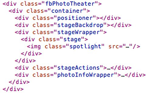
- First, we needed to construct the lightbox. By using a fixed positioned root,
fbPhotoTheater, we could separate the content from thebody. By giving the root awidthandheightof100%and then setting theoverflowof thebodytohidden, we can scroll the contents of the lightbox without scrolling the whole page. - Next, the
containerelement sets the horizontal bounds of the lightbox contents to960pxand centers it into the middle of the screen. With the structure of the lightbox set up, the remaining elements are used to position the content appropriately. - The
positionerelement is given aheightof100%and amax-heightof820px. That’s 720 pixels for the image and 100 pixels for the content at the bottom. We can use this by positioning thephotoInfoWrapper100 pixels up from the bottom of thepositionerelement and ensure that it’s always touching the bottom of thestageWrapper. - The
stageBackdrop,stageWrapper, andstageActionselements all have the same positioning CSS to make sure they always overlap each other. We give them amax-heightof720px, atopvalue of0and abottomvalue of100px. Thebottomvalue keeps the stage from pushing below our 100 pixel gutter, and themax-heightkeeps it from expanding past the tallest image size we support. We also give thestageWrapperatext-alignvalue ofcenter, so that the image will be horizontally centered. - The
stageelement is used to vertically center the image. This is the only JavaScript required for any positioning. We need to give thestagealine-heightequal to its ownheightso that theimgchild can be positioned with avertical-align: middle. The one positive note about this is that this calculation is done only once, not every time if the user is paging through multiple photos. - The image itself is given a
max-heightof100%to make sure it always scales to fit within the stage. - Finally the
photoInfoWrapperelement, which would normally sit underneath thepositionerelement, is given relative positioning and moved up withtop: -100pxto fill the empty gutter that’s always visible.
With the layout functional, we turned our attention to the JavaScript side of things. The old photo page loaded batches of 20 photos through AJAX along with their captions, comments, and so forth. This resulted in the calls taking upwards of 3 times longer than if each fetch were just the images themselves. By separating image and data fetches we also gained the additional benefit of allowing us to fetch more images and less data with each AJAX call to optimize their response times. To make the images load as quickly as possible, each time a users pages we check from which direction and prefetch the next 5 image resources so that when the user reaches a photo it will already be cached by the browser and displayed immediately.
When fetching data we abstracted out any knowledge of the data from the PhotoTheater JavaScript class. Each response from a data request sends back an object with keys being IDs of elements in the Photo Viewer and values being the HTML to insert into those elements. We simply loop over the response object and set the contents of each element. This allows us to change designs and the HTML layout without having to change the JavaScript. Finally, to make loading as fast as possible, we attached to every thumbnail an HTML5 data attribute containing the source URL of its full-sized version. This way, when you click a thumbnail we can pull that URL from the data attribute and immediately show you the first image without having to make an AJAX call, dropping the average load time for the Photo Viewer to under half a second.
The end product is a lightweight, ultra-fast photo viewing experience that has increased both viewing and interactions. In addition, users see less errors and less loading indicators.
We hope you enjoy using Facebook’s new Photo Viewer as much as we enjoyed making it.
