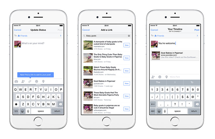
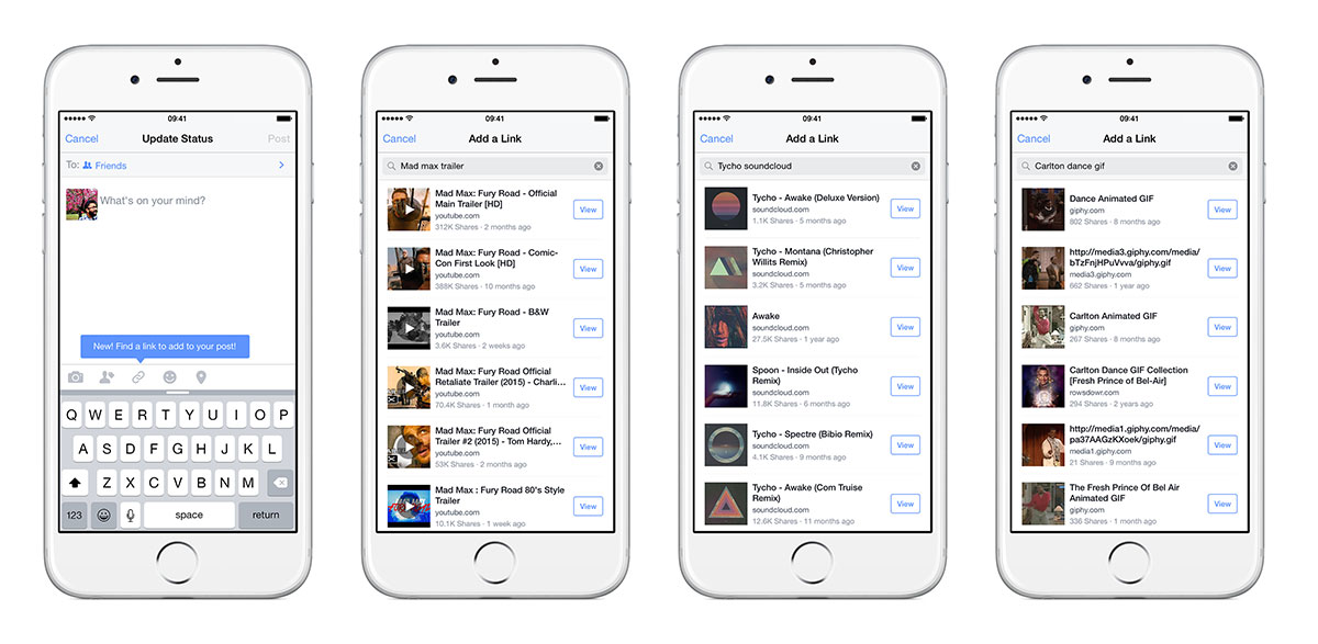
Today we’re launching a new feature on iPhone that allows people to easily find and share links on Facebook. Now, whenever you want to share a specific web link in your posts, just tap the new link icon, type in a few keywords to search for a link from our index of posts, and share it.
We think this feature makes it much simpler to share web links with your friends on mobile, whether it’s an interesting news article, a funny video, or a favorite recipe. Here’s the story of how it moved rapidly from insight to launch.

From idea to hackathon
In January, Rousseau Kazi, a product manager who works on search, was frustrated again by how hard it was to share a link on his iPhone. He had to leave Facebook, open a browser, go to a web search engine, enter keywords, scroll to the result, open it, copy the URL, go back to Facebook, paste the URL, and then — at long last — post and share the link. It’s exhausting just writing that!
Rousseau thought there had to be a better way to share links. Back in December, we introduced a feature that let you search for posts that had been shared with you. He realized that Facebook already had a terrific index of what people would likely want to share: links that had previously been shared by others. So he created a prototype, showed it to a few colleagues, and then rallied a small team to build it out at a hackathon.
We built a functional prototype of this feature one night in January. While a designer built the user experience, four engineers built out the server-side and backend functionality, mobile APIs, and iOS experiences that power this feature. While our index of over a trillion posts was full of shared links, Facebook Search had never surfaced them like this, so we needed to find ways to rank and return this content.
One of the biggest challenges was balancing social ranking signals (like whether a link was shared by your friends) with global ranking signals (like how popular a post was and how strongly a query matched its text). The Search team had already put a lot of thought and work into this, which meant we could quickly build out a product that would return results as you type. We came up with a lot of optimizations during the hackathon and thought through a bunch of ways we could make it faster before launch. We added client-side caching, turned off ranking features that were not valuable to our use case and optimized the page size for results to minimize time until the first results loaded.
While hackathons are often associated with engineers and designers, we also look for ways to leverage our co-workers in other roles. Their contributions were really valuable. A data analyst put together a detailed analysis of the discrepancy that exists between sharing links on desktop and sharing on mobile, further validating how useful this feature could be. He helped us understand link sharing on different surfaces, giving us a sense of where to focus our integration. He also broke down the types of content that are shared, to help us decide whether to organize the experience into categories (videos, articles, etc.) or go with the unified search experience we eventually built. A user experience researcher started digging into data from some of our past studies to understand how people thought about sharing on mobile.
By the end of the night, we had something we were all really excited to use and thought would be compelling to our co-workers and, more important, to the people who use our iPhone app. There was still a lot of work to do on the UI, integration was hacky, and we knew there’d be a lot of room for improvement with our ranking. Even so, we already had something we knew we would use day-to-day.
From prototype to product
Since this feature spanned many teams, we knew we’d need to get others on board to help. But with a prototype in hand, we were able to earn their help and support for our vision pretty quickly.
Over the next five weeks, we worked with engineers and designers from various teams, all while keeping our primary projects running smoothly. (Remember — this was our side project!)
We had to figure out how to guide people through this new experience. So, we built in some initial suggested links that appear after you tap on the link icon but before you type anything in the search bar. We created variations on these suggestions, variations on the UI, and the ability to tweak many parameters of ranking live so we could make adjustments outside a full app release. For example, we were able to run a series of bakeoffs without any code changes to identify what kinds and categories of initial suggested links resonated best. We also built out a new user experience flow that guided people through using the feature.
A user experience researcher ran a study of an early prototype with people outside Facebook, which validated that our product was easy to use and solved a well-known issue. And while we hadn’t yet launched our feature, the Messenger team was already excited enough about it that they built it into Messenger during our March hackathon.
After six weeks of building and polishing, we had a product we all felt good about releasing as a small pilot.
Understanding our feature
We designed this feature, like most products at Facebook, for rapid data analysis and experimentation. Within a few hours of kicking off our pilot, we were able to get really key insights, including:
- What percentage of people who started the flow ended up attaching a link?
- How did different designs perform, and how did they affect other types of sharing?
- What kinds of link suggestions helped people use the product?
- What types of queries were people entering, and what types of content were they sharing?
Over time, we answered key questions about how often people returned to the experience. If they used it once, were they more likely to follow through the next time they opened it up? We used this data to iterate on our designs, ranking, and initial link suggestions. There were many dynamic parameters we could update in real time, so on our first day we were already using this data to improve the experience. We also tried to understand which parts of the experience were working and which parts weren’t, as well as the types of queries that weren’t returning high-quality results. After more iteration, we launched the product today.
Now, the really hard work begins. We hope you find this feature valuable, but know there’s still room to refine our ranking and UI. More feedback and data will help us make our next round of improvements as we work toward launching on Messenger and Android.


