Visualizations often are a great tool for understanding code interdependencies, especially when you’re facing the challenge of determining interdependencies among more than 10,000 code modules. That happens to be about the number of modules that comprise the Facebook front-end code.
Facebook’s front end is written almost entirely in PHP. Recently, we normalized much of our PHP usage, particularly as it relates to module dependency management. This new system requires that when you write or modify a module, the modules that it is directly dependent on are fully determinable. Currently we do this via explicit specification, but we may do this automatically in the future. Making dependencies fully determinable ensures that circular dependencies are avoided, allows proper load order of modules, and provides a mechanism for understanding the interdependencies between modules.
To gain insight into the interdependencies of the Facebook front end, we visualized its structure. One obvious technique for this sort of structure is a classic arc-and-node graph visualization. The image below is just a small detail from a test graph with 1,024 modules — the full graph of 1,024 nodes is about 25 times larger. So if it’s a completely incomprehensible mess of spaghetti with 1,024 modules, imagine what it would look like with 10,000 modules!
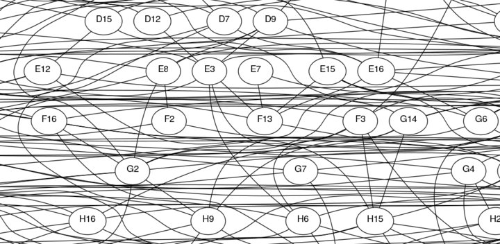
Clearly we needed another approach. So as a Hackathon project, we put together a different visualization that looks like this:
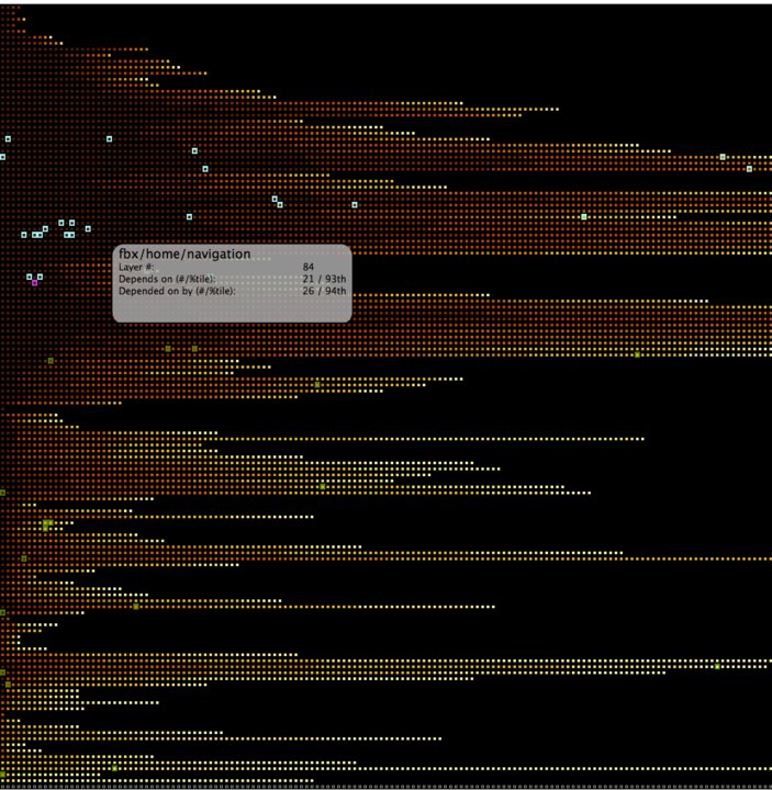
While a few blocks are cut off from the right hand side of this image, this largely represents over 10,000 modules and their interdependencies in a very information-dense manner. There are a number of aspects to this that are worth noting:
- -This diagram is divided into layers, where each row represents a layer, and a layer’s modules are dependent only on modules in the rows below it, and are depended upon only by modules in the rows above it. Thus, a module sinks to the lowest possible layer it can.
- -A system with more layers generally represents more interdependencies between modules (both direct and indirect/transitive dependencies).
- The visualization provided here colors modules darker if they have more dependencies, and moves them towards the left of their row.
- -The 10% of modules with the greatest number of dependencies across the entire grid are the darkest, the next 10% are the next darkest, and so forth.
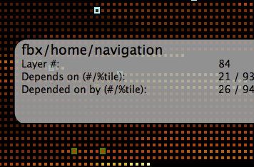
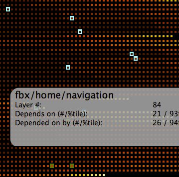
- -The magenta colored cell is the one the mouse is currently over, and the information box is associated with that cell. fbx/home/navigation is the selected module in this diagram.
- -The cells below fbx/home/navigation that are colored green are those the module is dependent upon, and the cells colored cyan are the modules that depend on fbx/home/navigation.
- -These dependencies are only “direct” dependencies — modules that explicitly specify their dependence upon or are explicitly depended upon by the currently selected module.
- -Looking at indirect, or transitive, dependencies can also be very interesting and fruitful. The diagram below includes (in more muted colors) the indirect dependents/dependencies of the selected module.
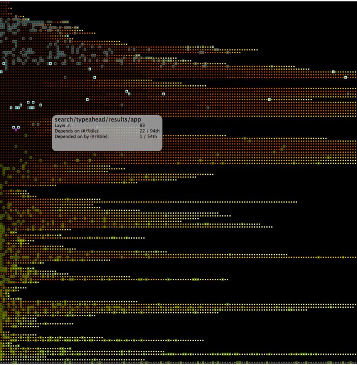
This is all fully interactive — as the mouse moves around, you see different modules selected and the information box updates. Naturally, navigating among 10,000 modules also requires interactive search capability.
There are certainly flaws with this representation — a key one is a dependency between modules is treated equivalently if there is one inter-module function call or 1,000. That distinction is not captured in this visualization.
We released this visualization internally for the Facebook engineering team to consult and gain insight into module granularity, dependency management, and the like. As with all Facebook code, this is a work in progress, so we hope to add more value to it as it evolves.
Greg, a software engineer at Facebook, can’t help but get mesmerized whenever he uses his visualization.
