Every generation likes to think it reinvents the world from scratch. But some things are shaped by history and geography as much as anything. Mountains, rivers, archipelagos, and long terrestrial crossings play a big role in deciding where, how, and how well different parts of the Earth get connected. This is a map of the global telegraph network from 110 years ago side-by-side with the internet of today:  One way to see the internet is as a physical manifestation of trade volume between cities, on a 40-year moving average. That is about how long it takes for economic ties to develop, demand to rise, and high-volume communications routes to be financed and built. Once built, these links tend to stick around. Governments and empires have come and gone, bandwidth has increased a billion-fold, but the network has the same general shape it had back when Mark Twain was sending witty telegrams. The only big change since then is greater ties between the US and Asia. Just from looking at where the cables go you can guess how long it would take to send a message. A telegram from San Francisco to Hong Kong in 1901 must have taken many hops through British Empire cables to Europe, through the Middle East, and so on. London to New York was fast and direct. The vestiges of the Spanish and Portuguese Empires show up in the many links between South America, the Caribbean archipelago, and the Iberian peninsula.
A cool thing is that you can measure these relative latencies yourself, using the present-day internet. If you run a website with a decent amount of worldwide traffic, you can use that traffic to map out how the internet responds with regards to you, and see how that matches with the gross structure of the ‘net.  I wrote about a cheap and cheerful way to generate this data last year, and the code has since been open-sourced as part of Yahoo’s Boomerang measurement framework. The basic idea is to have your users perform two tiny network requests: one to a throwaway hostname generated in the moment, like 8j48sas.dns.example.net/A.gif, then another to a different single-pixel image on the same host, 8j48sas.dns.example.net/B.gif.
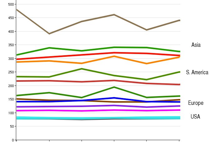
The first request will require a DNS lookup, TCP handshake, and HTTP transaction. The second only needs to do the TCP and HTTP steps. Now you have fuzzy measurements of how long it took to do a full HTTP round-trip (B) and to do a full end-to-end DNS lookup (A – B). Real-world data on DNS performance is generally considered hard to come by. The domain name system is designed with caching and intermediaries at all levels, so you as a site owner only see part of the story during normal operation. You can buy data like this from commercial services like Gomez or Keynote, or get it yourself if you happen to have, say, a browser plugin installed on millions of computers. Otherwise, this Javascript method is less accurate but works well enough. Here is a chart of median (50th percentile) DNS latencies experienced by a random sample of Facebook users, broken down by country. As you can see, there are several lines crowding together at the bottom. That is the US and parts of Europe like the UK and Belgium. Facebook’s DNS servers tend to be physically close to users in those countries. Spain and France are a bit higher up, and the rest of the graph is a mix of Asian and South American countries.[1]
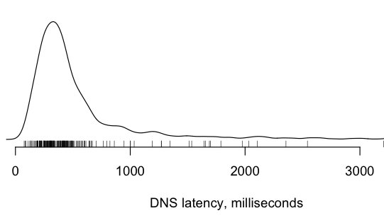
The median value only tells part of the story. Here is the worldwide DNS latency data as a density plot, to show the distribution. Notice that a substantial number of users took more than 500 milliseconds just to look up a hostname. This is the uncached worst-case, of course, but it’s something to keep in mind.
HTTP Latencies
Here is the chart for measurement B, the TCP + HTTP latency. This better reflects the real “geography” of the internet, because the HTTP requests travel all of the way back to our web tiers in the United States. There is much less volatility in these measurements day-to-day; it’s controlled more by basic network conditions and speed-of-light and less by the health of various DNS recursors around the world. 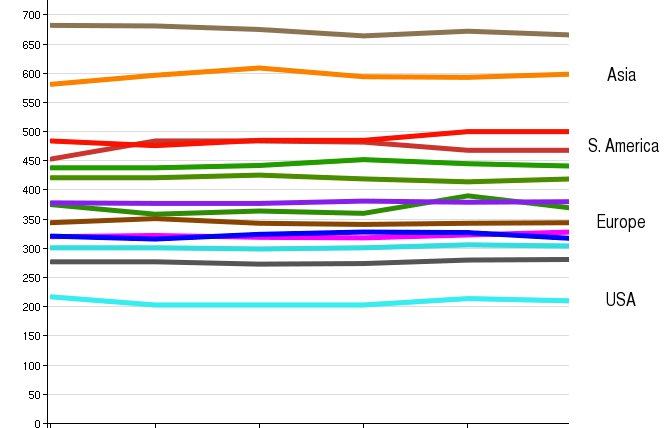
How low can you go?
So how fast are these links between countries, compared to what is possible? Below is a chart of the same median HTTP latency data, averaged over a week. The short light-grey bars represent the theoretical minimum. If you could carve a direct line between any two spots along the surface of the planet, this grey bar would be the internet round trip time between the US and the given country. [2] 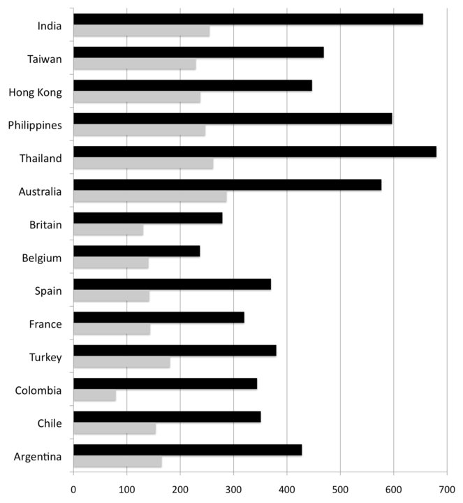 We can learn a lot of things from this chart. The most obvious is that HTTP latency between Asia and the US is worse than US-Europe. The Pacific Ocean is wider than the Atlantic, of course, but raw distance is not the only factor. Economics and local geography play their part. Look at the ratios between the black bars (real) and the grey bars (theoretical). Both the fastest European and Asian countries have real-world latencies at or below 2X the theoretical minimum, which is pretty impressive. Few technologies get within spitting distance of the physical limits of the universe. These low-multiple countries tend to have fortunate geography, or a strong history of economic relations with the United States, or both. Other countries with less-strong trade ties, such as Spain, or lots of little islands like the Philippines, have multiples nearer to 2.5X and above. While Australia is a bit farther than Thailand it’s 15% closer as far as the internet is concerned. More investment has been put in by the cable operators to make that route fast and wide. In fact, Australia (population 22M) a comparable amount of bandwidth to the US as all of South America (population 385M). The multiples of South American countries start at 3.5X and go up from there. North-South routes are hurt by an unlucky trifecta of mountains, long land crossings, and archipelagos. There is only one cable that serves the Pacific side from Los Angeles to Panama. It’s hard to justify building lots of capacity on the Pacific side, because the Andes mountains cut off that part of the continent from the rest. Most traffic follows a long and painful path across the entire length of the US to the Atlantic, then takes a right turn and down another 800 miles of the Florida peninsula. It exits Miami and immediately hits a congested maze of cables, hopping in and out of the water as it navigates the islands of the Caribbean. Someday South America will get better connected, but natural barriers drive the costs way up. There are other interesting cases such as Belgium, which has the lowest latency and lowest multiple (1.6X) of any European country. The reason is that Belgium is well-placed as an internet nexus, being a) close to Britain but away from the Channel and b) geographically convenient for branching off into the rest of Europe.
Try this at home
These measurements are very skewed towards the United States. It would be awesome to see measurements from other spots and different traffic patterns from around the world. The code to collect this data (and a lot more) is open-source and simple to implement. So try the experiment for yourself and let us know what you find. Carlos Bueno, an Engineer at Facebook, loves pinging the tubes.
Notes
[1] This chart generally agrees with data gathered by Yahoo and Microsoft. The data is very US-centric; the picture will be quite different if you were to run the experiment from a site based on another continent. Facebook’s servers are largely in the US, so naturally we care most about how to get bits from here to there and less about, say, between India and Saudi Arabia. [2] The theoretical minimum latency is calculated using the average speed of light through optical fiber, over a hypothetical cable laid in a great circle line between the town of Independence, Kansas and the centroid of the given country. This time is multiplied by 4 to approximate the two round-trips necessary to complete a TCP handshake and HTTP transaction. You can read all about Great Circle routes and the speed of light through fiber in Wikipedia, or just use Wolfram Alpha to do it for you.


