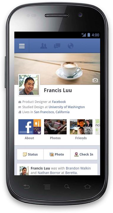
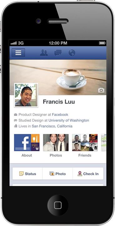
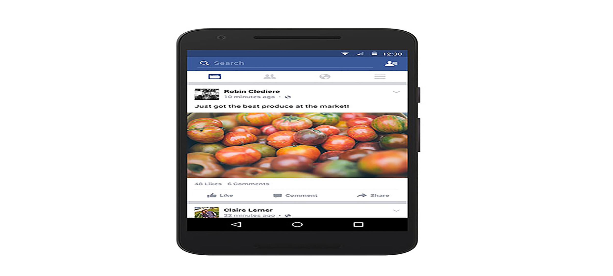
Completely rewriting one of the fundamental pages of mobile Facebook was a huge engineering task – and required a lot of design work to get a model that would scale to all the interfaces we needed to support. All the stories needed to be re-implemented for mobile, with new designs to suit smaller viewports, different styling to match the capabilities of different devices, browsers and platforms, and additional interactions unique to touch devices to help navigate all of the new content. Fortunately the back-end work handled both mobile and desktop just fine, and by f8 in September we had completely designed and built working versions of all the stories, tabs and interactions. We’d been working round the clock in Palo Alto and Seattle for months, so to finally watch mobile Timeline scroll smoothly up the screen during the keynote was an amazing feeling.


We built Timeline for the diverse set of mobile devices that access Facebook while ensuring that the design and data architecture scaled across platforms. Today you can see mobile Timeline on m.facebook.com for Touch devices, and the native Android and iPhone applications, all using the same codebase with a combination of HTML5, device detection, a JavaScript native bridge, and embedded webviews inside our native application.
Extended content
We had to build mobile Timeline in a way that would give people a rich way to view all the stories from their birth until now without overwhelming the device. So, we load the most recent stories immediately, and then let the user scroll back in time and tap to open a recent month or year.
Inserting all the additional content into the DOM at the same time that the user might be manipulating the view required a combination of timers and logic to ensure that the DOM is only changed if the user is going to be able to see it. In order to smoothly scroll both vertically and horizontally, we had to hardware-accelerate sections of the page using the GPU. However, the immense amount of content on the page meant that hardware accelerating someone’s entire Timeline would crash the browser.
To overcome this, we tested several different ways to provide smooth scrolling while developing Timeline and found that the best approach was to use adaptive hardware acceleration. Using the CSS rules we can render each unit two different ways: a complex version that is hardware-accelerated, and a simple version with no acceleration. Using a combination of timers and knowledge of the current viewport, we switch units between these two states as the user scrolls up and down.
You can see that we temporarily blank out sections that are a long way from the viewport as the user is scrolling. Once scrolling ceases, these sections appear again. This gave us everything we needed: ability to open up someone’s entire Timeline on a single page, smooth scrolling and swiping, and no memory crashes.
Horizontal scrolling and navigation
Mobile Timeline has an extensible series of application tabs to hold everything from your favorite Movies and Books, to all the places you’ve ever lived or been. We developed a JavaScript swiping component that lets you page through About, Friends, Photos, Likes, Interests, Map, Subscriptions, and Subscribers.
We also use this for Photo albums and multiple Posts – times when you often want to quickly swipe through a whole series of content without leaving the context you’re in. This was challenging to build well, as the swiping interaction needed to feel smooth without overloading either the GPU or increasing bandwidth unnecessarily.
We use lazy loading on the photos so that they only appear if you start swiping, but we deliberately download one column outside the viewport so the user can see the overhanging photos as a hint that swiping is possible. We also need to judiciously place the horizontal-swiping component into hardware to ensure that the very first touch is responsive and smooth.
Design philosophy
The first five versions of mobile Timeline were not in distinct sections but instead were like the profile today – a single pane with rows that contained stories. After much iteration to get this to feel consistent to the desktop experience, it still didn’t feel right. So, at the cost of story width, we decided that setting up a similar environment to www – distinct sections on a blue background, felt pretty good and as if it and the desktop design were “drawn by the same hand” at a macro level. With the limited real estate on mobile, we now had to look into ways to make the content feel rich within the more confined system.
We found a couple of wins by taking the column reserved for the feedback button out and converting it to a row on the bottom, which got back some horizontal real estate and made the feedback and UFI feel more related. We also shifted the positioning of the profile picture so we weren’t wasting an entire column on the left hand-side. This gained back a bunch of space and allowed us to have full width content.
Photos & Album units
Square crop photos didn’t work because maintaining 1:1 aspect ratio at full width made the stories much too tall. Cutting them down and placing them inset in the unit felt too constrained and not object-like—they looked cramped and the white frame made them feel less interactive. We found that if we overhung them off the side we could gain back a total of 48px horizontally and avoid the visual of a “box-in-a-box-in-a-box.” Some other good effects of this decision were that it matches other design features like the profile picture lying over the cover photo.
This also paved the way for album sections. Before, you’d only get two to four photos in an album story, which are supposed to depict one or multiple events in your life. The barrier to get a feeling for those events was pretty high as you had to jump into a photo and browse one at a time to get the big picture or tap a small link into the album and thereby totally lose context. By allowing people to explore these albums in context you make more photos available, which provides more context (now with 16 photos to test this instead of two or four) and makes it easier to decide what content they want to explore.
Higher-definition images
Scrolling through someone’s Timeline on the web is a very visual experience—you see their photos, their friends, and all the places and experiences that are important to them. On mobile Timeline we wanted to deliver this same quality of experience but without sending a single extra byte down the pipe. By sending an image sized precisely to how it will appear on the screen we could minimize bandwidth but also ensure no client-side scaling or cropping was necessary, which in turns saves on CPU/GPU cycles on the device.
When a request for mobile Timeline hits m.facebook.com or our iPhone and Android clients, we look up the UserAgent string to determine the physical pixel width of the device, and then use that to decide the dimensions of all images on the page. The page we send to the device embeds logic in each image URL that in turn asks the CDN to crop and/or scale each image to the precise size requested. In some devices this includes requesting an image where the pixel count is 1.5X or 2X the logical size, due to increased pixel density on the device. If a user is tagged in the image we center on the tag(s).
When the device is rotated from portrait to landscape, we stretch non-square images rather than download a version with a new size. In this instance we decided that the loss of fidelity was less important than showing a landscape version immediately.
Looking ahead
Mobile Timeline is now available on touch devices for m.facebook.com, Android, and iPhone, with more interfaces coming soon. No matter what device you’re on, we hope mobile Timeline helps you better connect with your friends and see the updates that are important to you when you’re out and about.
Mick Johnson, the Product Manager on mobile Timeline, enjoys setting his cover photo from mobile.


